


Pariah
-
Posts
45,406 -
Joined
-
Last visited
-
Days Won
199
Content Type
Profiles
News
Store
Forums
Downloads
Events
Posts posted by Pariah
-
-
"You don't find Cathy attractive?"
"No, I don't."
(to the camera) "No, I'm not going to tell my nine months pregnant wife that I find her replacement objectively attractive. Just like I'm not going to tell my 2-year-old daughter that violent video games are objectively more fun. It's true, but it doesn't help anybody."
-
I think my favorite boy band of all time is probably The Beatles.
-
There's a Young Sheldon spin-off?
Isn't Young Sheldon a spin-off itself?
-
For a song called "Piano Man", the guy with the harmonica won't shut the **** up.
- mattingly and Ockham's Spoon
-
 1
1
-
 1
1
-
Quote of the Day from Social Media:
"At least when Michael Jordan pushed off, he made the shot. 🙄"
-
-
We run along easy at periscope depth
Sun dappling through clear water
So went the dream of the drowned submariner
Far away from the slaughterYour hair is a strawflower that sings in the sun
My darling, my beautiful daughter
So went the dream of the drowned submariner
Cast away on the waterFrom down in the vault, down in the grave
Reaching up to the light on the wavesSo she did run to him over the grass
She fell in his arms and he caught her
So went the dream of the drowned submariner
Far away on the water
Far away on the water -
Leave the guns, take the cannoli.
-
20 hours ago, Bazza said:
It's only in the darkest night that you can truly see the stars.
True both literally and metaphorically.
-
-
2 hours ago, death tribble said:
I believe in my team as you in yours. This season, The Vikings will reach the Super Bowl and emerge as Champions
HA!
I have precisely no belief that my team will reach the Super Bowl and emerge as Champions.
-
Nah, kicker Wil Lutz has already claimed #3 for next year. #2 is also off the board, as Pat Surtain II isn't going to part with that number as long as he's with the team.
A quick scan indicates the following potential QB numbers are available: 5, 8, 10, and 16. Elway's #7 and Frank Tripucka's #18 are off the table (although Frank graciously allowed some guy to wear #18 for a couple of years a while ago). i have no feeling which way Wilson will go.
Maybe Zach Wilson will play better out of the harsh spotlight of the Big City. Maybe having a coach who has actually worked with a good quarterback before will also help. And hey, he played his college ball at altitude, so maybe that'll help, too.
I'm trying to take Monty Python's advice and always look at the bright side of life.

-
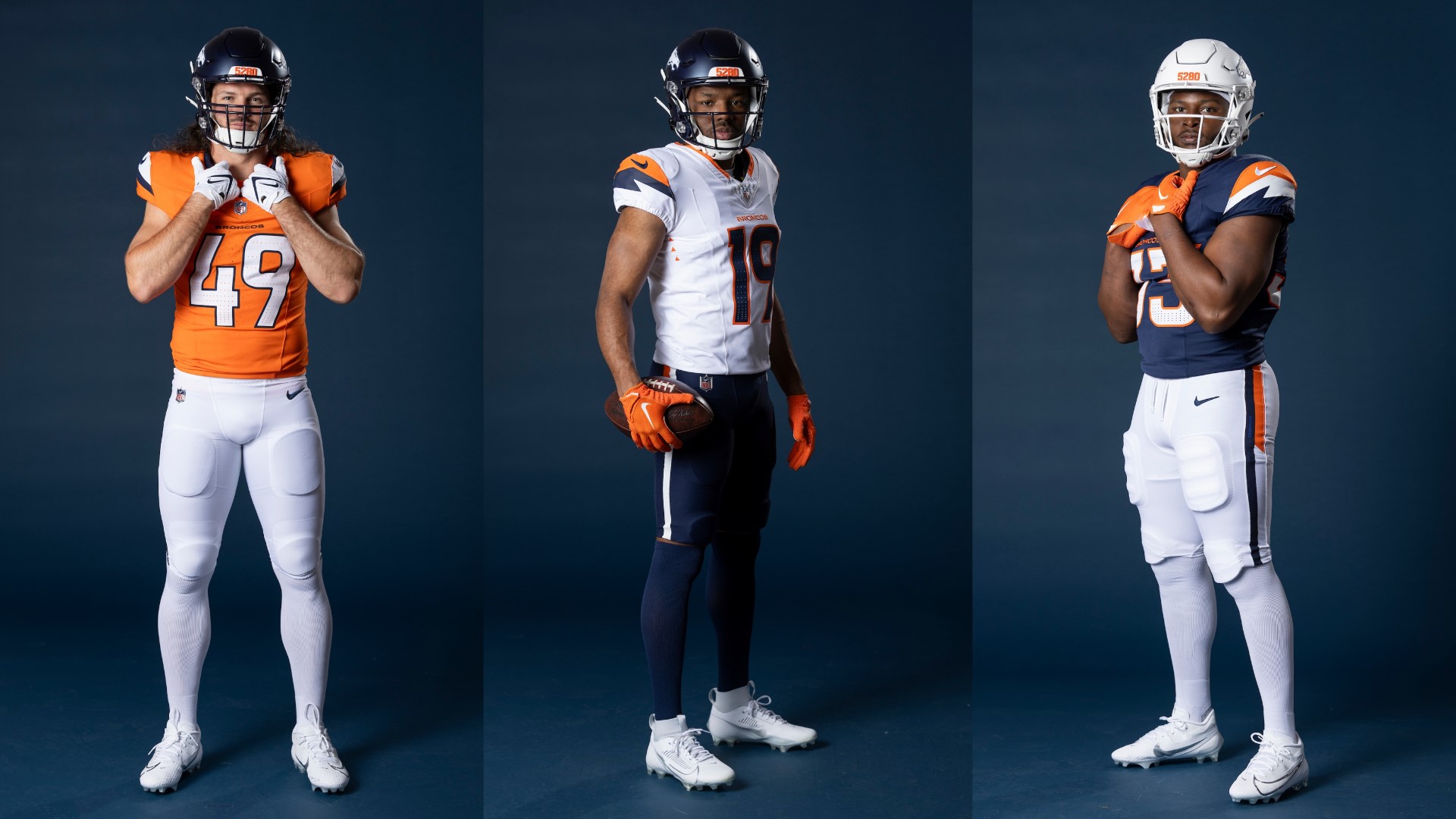
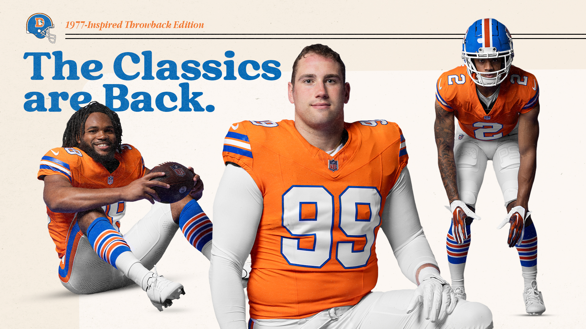
So, I've had a bit to ruminate upon the Broncos' new uniform set, seen (mostly) below:

I like them. They're clean, they're distinctive, and they don't have the accursed side stripes on the jerseys. I wish they had striped socks, or socks that didn't make the lower half look like a leotard, but I guess you can't have everything. I'm also a little perplexed at the lack of a center helmet stripe, but that's not too big a deal.
Perhaps best of all: A full Orange Crush throwback!
See, those socks are awesome!
Overall, four out of five stars.
-
The draft is later this week, so why not kick off a new thread for the coming season?
-
All I remember of the dream is this:
There is a woman in the city, a large, powerful woman with golden hair and green eyes. To everyone she meets, she says the same thing.
"There is a man in the city with a tattoo on his face that says 'There is a spider in my mouth.' Have you seen him?"
-
I think Miami already did all of that.
-
14 minutes ago, Old Man said:
Blue and orange is a ghastly color combination regardless.
")
While I am obviously not a huge fan of the Raiders, I do have to say that their look is iconic. The black and silver work really well together, and they have resisted the temptation to do a lot of unnecessary stuff with it. They look good, and have for a long time.
As far as blue and orange goes, it is certainly better than the brown and mustard yellow the Broncos were wearing for the first few years of their existence. Remember those throwbacks from a bunch of years ago? The ones with the vertically striped socks? So yeah, I'll take the blue and orange. But I would prefer royal blue, given the choice. But I wasn't.
(I will also point out that 9 of the 11 Stanley Cups won from 1980—1990 were won by teams wearing blue and orange.
 )
)
-
Eh, not entirely. I mean, they won their three Super Bowls wearing that uniform set. One of them wasn't even that long ago, although the team's fortunes have been dreadful since then.
But the fact is I didn't like the uniforms much even at the beginning. I really disliked that the primary color was changed from orange to navy blue. Not even the royal blue I'd grown up watching. With the rounded numbers, I thought we looked an awful lot like the Bears. More to the point, I felt the uniforms were gratuitously dark, like so many other things in the mid-90s.
And the stripes ... Mother of Hades, the stripes. They were hideous. New and daring and edgy for the sake of being new and daring and edgy. What purpose did they serve? How did they represent the team? Or was it just a cash grab by Nike, whose signature swoosh the curve of the stripes superficially resembled? I thought they looked ridiculous.
And in the mid-90s, those uniforms were everywhere. I remember a lot of college teams adopting that same template, most notably Boise State, who looked better than Denver in the set because they had the right color of blue. They were all the rage for a few years, and then faded into obscurity. Except in Denver, where they persisted for a generation. Even by about 2005, they looked dated.
But yeah, there have been some great moments with those uniforms. The three Super Bowls, of course, but also things like Tim Tebow's overtime touchdown pass, Peyton Manning's quarterback sneak against the Cowboys that even the cameraman didn't see coming, and so long. So yes, there are some good memories.
But it's time for a change, and I'm glad it's coming now.
-
The new Broncos uniform set drops tomorrow at 9:00 am MDT.
I've seen leaks for a couple of weeks. How close any of these are to the real thing is hard to say, at least for the next 10½ hours.
As long as it remains blue and orange and drops the Nike parentheses stripes, I'm pretty sure I'll like them better than what the team is wearing now.
-
13 hours ago, Asperion said:
A: That star is a zombie .
Q: Are you really telling me that the remake of the Thriller video actually stars the reanimated corpse of Michael Jackson?!
A: Twenty minutes at 35,000 K ought to do it.
-
13. For every vision, there is an equal and opposite revision.
-
...who is, ironically, probably most famous for the touchdown he didn't score.
-
The average Imperial Stormtrooper is 5 feet eleven inches tall.
But the average metric Stormtrooper is 180 centimeters tall.
-
Nuggets 114, Lakers 103
The Nuggets have beaten the Lakers nine straight times, if memory serves.
Gentlemen, let's make it twelve, shall we?


 )
)

Extra! Extra! Read All About It!
in Non-Gaming Discussion
Posted
If it doesn't have Tim Curry and three different endings, I'm not interested.