


Samurai007
-
Posts
92 -
Joined
-
Last visited
Content Type
Profiles
News
Store
Forums
Downloads
Events
Posts posted by Samurai007
-
-
Re: Character Art
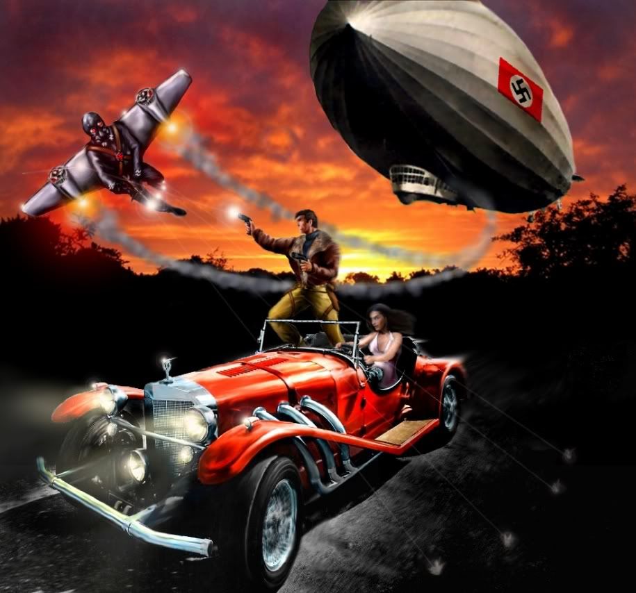
BlackWyrm Games has posted a full gallery of the color pulp and golden age character artwork from The Fires Of War' date=' over at blackwyrm.com.Nice work! Some of the coloring is a bit flat, but with that many characters, you probably didn't have time for a lot of shading and shadowing. I especially love Old Glory! Where is Die Kriegsmaschinen, though?
-
Re: Pulp Hero, after looking it over
That's just a before-publication estimate that Ben will get around to correcting pretty soon. Sometimes books end up being longer than expected' date=' sometimes shorter.[/quote']Wow, so it's really 432 pages? I was going to get it before (I love Pulp and Victorian era Steampulp, as I call it), but now I really, REALLY want it!
-
Re: Pulp Hero, after looking it over
Ironically' date=' even though it's 16 pages longer than FH, PH is physically a little bit thinner than FH because it was done by a different printer. But there's definitely a lot o' words in there. Glad you're enjoying it![/quote']I don't understand... isn't FH short for Fantasy Hero? Fantasy Hero is 416 pages long... if Pulp Hero is 16 more than that, it's 432 pages long! Yet, your own website lists it as 256 pages long: http://www.herogames.com/Products/PH.jsp Is your site info wrong or does FH refer to some other 240 page book?
-
Re: pulp hero over opinions?
I was rather hoping that they'd decide at the last minute to use the Pulp Hero cover I did for the latest Digital Hero on the book instead, but they'd already commissioned the book cover, layed it out, and sent it off to press.
-
Re: PULP HERO -- What Do *You* Want To See?
We'll preview the cover sometime in the next couple of weeks. We just unleashed two last Friday; we gotta space 'em out.
Cool. I hope it has a more interesting cover than the workmanlike Predators, Combat Handbook, and Equipment Guide. Pulps are in part famous for their thrilling covers...
-
Re: PULP HERO -- What Do *You* Want To See?
I've heard that the Thule Society was also a Nazi group very interested in mythology and the occult...
-
Re: PULP HERO -- What Do *You* Want To See?
Any chance we could see a preview of the cover, please...?
-
Re: Anyone get DC: TAS yet?
All my opinion...The content was useful.
The artwork was

Now...
I also really like your work Samurai007. Question -- how long would it take you to do a B&W of this piece of art (yours of course): http://photobucket.com/albums/v11/Tommiskey/Art/?action=view¤t=cleric_cover_glow_vsm.jpg
Reason I ask, is there is usually a very tight timeline for putting together books, and that includes art.
Nadrakas...
Thanks again everyone! Dave, if you read this, please let me know when I can add the last couple DH pictures to my online portfolio to show the people here!
Nadrakas, if you mean a b&w version of that exact picture, about 2 seconds to click the "greytone" button and save it
If you mean a similar picture in b&w (and I think you do), probably a couple days or so (maybe 8-10 hours of total work). I usually only do that much work on cover pieces... that picture was for the cover of a D&D supplement called "Unorthodox Clerics". Generally, the more I'm paid (and the more time I have till the deadline), the more effort I can put into a picture. I've done pictures for as little as $5 each, but they don't look like that... I generally try to plan the piece out so that I spend about 1 hour per $5 of the price. Any more time than that and it becomes unprofitable for me. If I can finish faster and still provide the level of quality being paid for, I do. Dave has me working on a Pulpish cover for DH right now that should be as nice as that Cleric cover when I'm done... -
Re: Anyone get DC: TAS yet?
and i bet you work at a reasonable price, too??seriously, i think you'd make an excellent "house" artist for HERO--i know that PALLADIUM had one for quite a while in the 90's--KEVIN LONG--they paid him a descent salary and he provided them with a SH-LOAD of art--much much cheaper than paying him by the piece....
Certainly do, as Dave Mattingly can testify to. I'm sure Digital Hero has a smaller art budget than the printed books, and I've done work in 3 or 4 issues so far, including making some crazy deadlines... "Hi, we need 6 pictures in 3 days..."
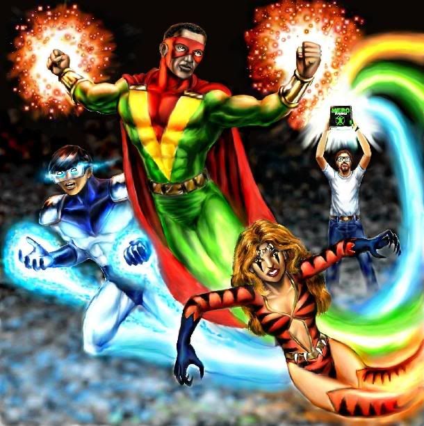
 In fact, I'm working on a pulpish DH cover now, and I already finished 2 interior pieces for an upcoming issue. If/when Dave gives me the ok, I'll post small versions of them here. (Usually I don't add commissioned pieces to my portfolio until I get that ok).
 -
Re: Anyone get DC: TAS yet?
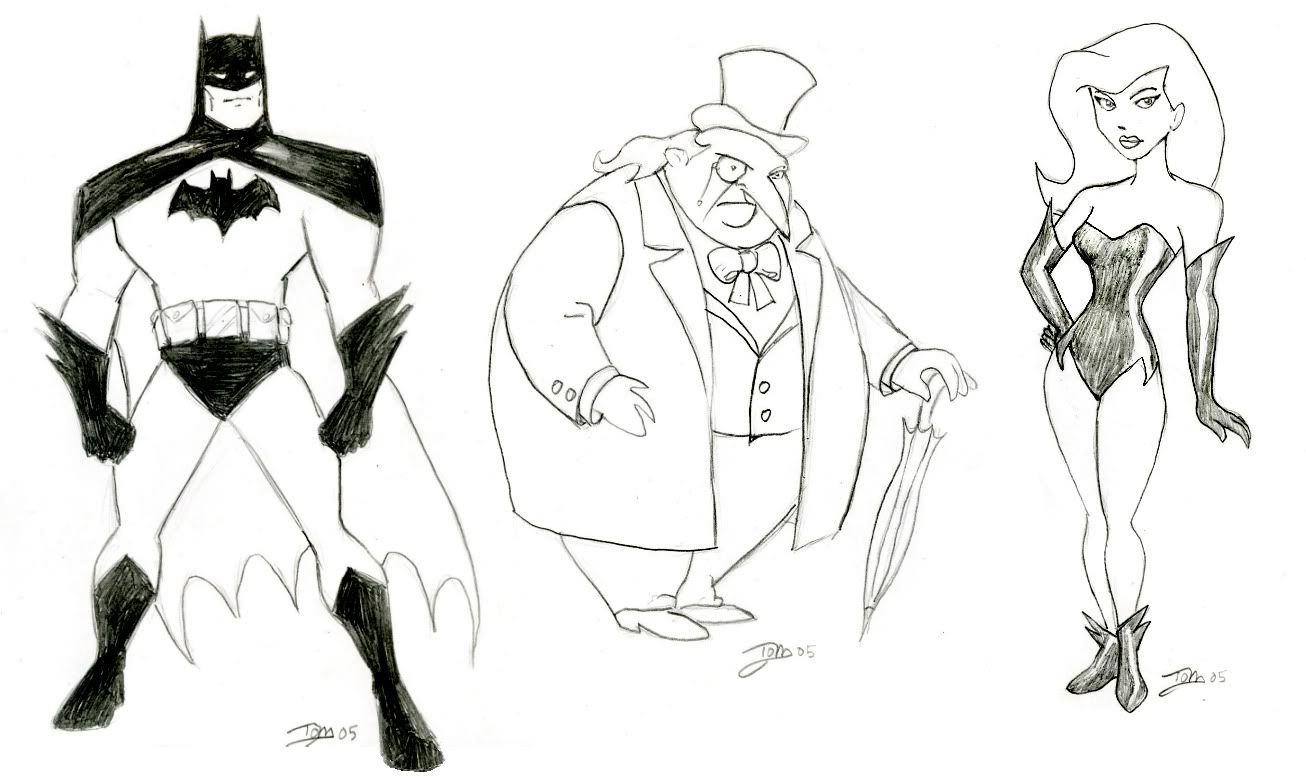
Based on what I've seen of your work' date=' you'd be a great choice for DoJ to pick up as an artist. Your work looks great. I do wonder if you could pull off the somewhat stylized format that is "animated supers" these days; your work looked a little realistic for that.[/quote']Thank you! I am very versatile and can imitate a great many different styles, from a variety of comic book, manga, and animated artists. I teach a class called Cartooning and Comic Book Art, so I've done everything from Bruce Timm to Disney, Rumiko Takahashi to John Byrne, and realistic nature and animal art as well. You name it, I can do it.
Here is a Timm style picture I just uploaded: http://img.photobucket.com/albums/v11/Tommiskey/Art/bat3sm.jpg
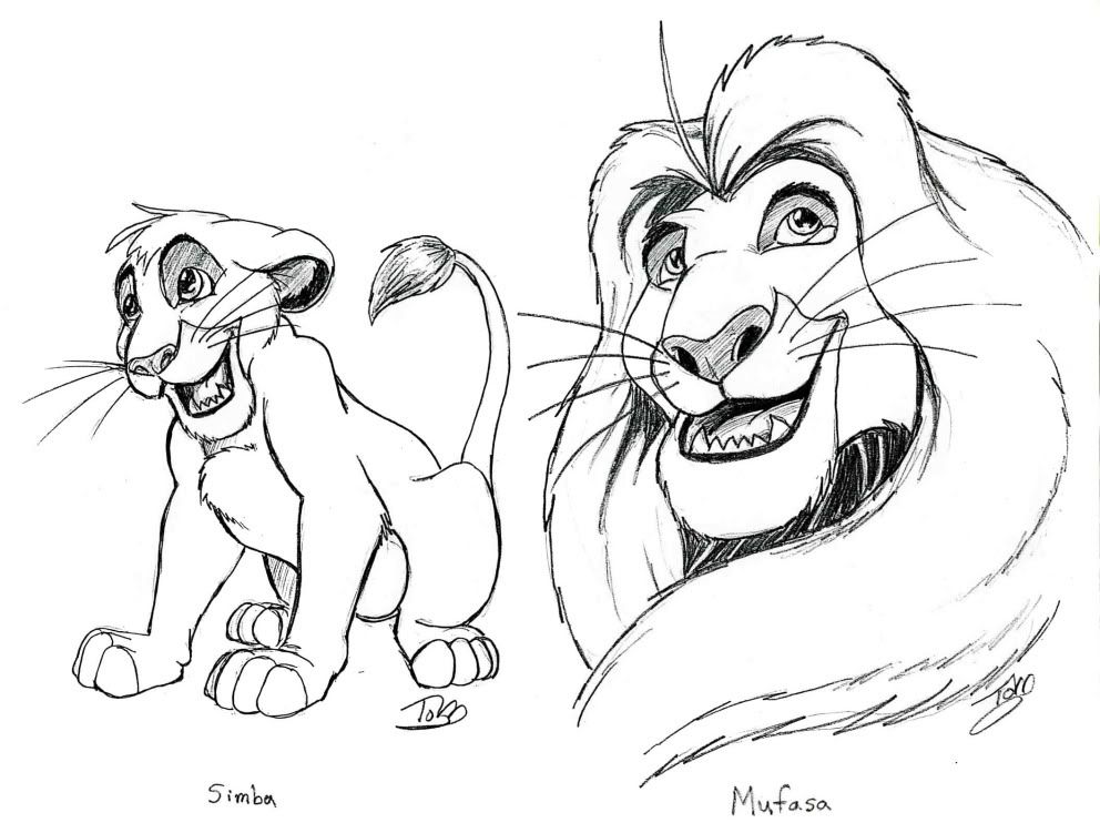
Here's a Disney one I just added as well: http://img.photobucket.com/albums/v11/Tommiskey/Art/SimbaSM.jpg
The great majority of my art isn't posted there... I have dozens more pictures on my computer and laying around...
-
Re: Anyone get DC: TAS yet?
Samurai007' date=' is there a site where we can take a look at your work? I don't have any issues of DH, sadly.[/quote']Thanks Mitchell, and yes Buzz, there is: http://photobucket.com/albums/v11/Tommiskey/Art/
On pg 2 is a cover I did for Digital Hero that includes a self portrait...

-
Re: Anyone get DC: TAS yet?
I am not surprised to hear that the interior art in DC:TAS is disappointing. Steve Long has repeatedly made it clear that interior art is not a priority for their products... fine' date=' I say. What I do not understand though is for every time he makes that clear, the other side (the customers and reviewers) chime in and say that a certain quality level of interior art matters to [b']them[/b]. Who does Steve Long produce these books for if not for the people who purchase them? The saying goes that the customer is right, and while there is no need to do a 180 degree turn and suddenly go state of the art with their art, perhaps putting forth the additional effort to reduce the recycling of old art and to get creative with who they go to for the new art might satisfy the customer base, a wise decision. Heck, there are some pretty excellent artists here on the forums that would probably jump at the chance to get exposure for their work. Perhaps there needs to be a Art Director for Hero Games (perhaps there is one, I never really have looked to see).As to what I hear about layout and proofreading problems... sounds like when Steve Long ramped up the number of books on the schedual, perhaps he ramped it up a bit too much. Reconsidering the pace he has set for the company might be a good idea, quality is more important than quality if Hero Games is going to maintain a decent reputation.
But these are the thoughts of just a single customer, I do not expect that anything I am saying will make an impression.
The difference this time is that, in many peoples' opinion, DC:TAS is a BIG step down from the usual DoJ art effort. It was, with only a few exceptions (mostly the 4e reprint art), really bad. Embarrasingly bad. Jr. High notebook scribble bad. Blood of Heroes bad.
It also (with a couple exceptions) wasn't even attempting to create an animated style, as you might expect in an "Animated Series" sourcebook.
You don't need a huge art budget to get better work than DC:TAS had. In fact, it prompted me to write to DoJ and offer my services as an artist. I'm sure there are a lot of artists out there who'd be happy to work for DoJ who can do a much better job than we saw in TAS.
-
Re: Help with Japanese villains
I am getting ready to run a storyline where the Axis Powers won WW II and the campaign city is under the control of the Japanese. I need help with Japanese names for the following concepts:A flyer, sex and power set being whatever (if anyone has any good ideas, I'm open)
A female who can become desolid (effectively a ghost) and has a "death touch" while Desolid
A male who can cause any object he touches to explode (including people)
A male shrinking martial arts master/assassin
A male Japanese version of Superman
A male lightning thrower
Thanks in advance!
Sounds to me like you are creating a Japanese/Axis version of the Freedom Fighters. I recognize the descriptions... in order, they are:
Black Condor
Phantom Lady
Human Bomb
Doll Man
Uncle Sam
The Ray
Am I right?
-
Well, I see Dr. Silverback as a cross between the Beast (scientist trapped in strong bestial body but retains intelligence) and a heroic version of Gorilla Grodd (or maybe Solovar). Also, his origin is highly similar to a JLA Elseworlds story which reimagined the Justice Leaguers as half-animal hybrids created by Dr. Moreau. There has also been Angel and the Ape and SAS's Deadeye Chimp.
Some of the others are fairly iconic... Scarlet Shield is a bit like Captain America and Mr X is close to Crimson Avenger or the golden age Sandman. But many of the characters are not very iconic, and many don't even wear costumes! Most of the PSI characters, Kodiak, Kevin Poe, Freakshow, etc. Perhaps it is more realistic that they don't have costumes, secret IDs, etc, but that detracts from the comic book feel of the setting, IMO.
You know, I think Millenium City feels much closer to an Aberrant setting book than it does for a 4-color comic setting. Lots of characters that are not in costumes and don't do the traditional hero/ villain thing, but instead are scientists, run schools, work for the police/ FBI, are common thieves, mercs, and killers, etc. Just a very different feel from the 4-color silver age type of setting.
-
Well, I finally got Freedom City yesterday and was able to compare it with Millenium City. I found that, for 2 superhero setting books released at practically the same time, they had surprisingly different "feels" to them. Monolith, I have to disagree that MC "feels like DC and Marvel shaken up and poored into the hole in Detroit". In fact, it hardly feels like a comic book at all, IMHO. Most of the characters are not iconic and with a few exceptions, are forgettable and not very eye-catching. (Dr Silverback is by far the best character in the book) In fact, most of them feel like GAME characters, not COMIC BOOK characters.
I really enjoy that "Astro City" feel of Freedom City, but that might not even be the best term for it... It isn't ripoff of Astro City so much as it is an homage to the comic books we grew up with. Underground kingdoms of mole men, warlords from the negative zone, an ultimate android built to destroy an entire team of heroes, psychotic criminals with a strange and unique motif, undead sorcerers from ancient civilizations... all of these things describe both characters in actual comics and characters in Freedom City, and the list goes on and on. This is a dangerous ploy, as some may say "Ahhh, that is just a blatant copy of the FF villain Mole Man!" But the book made just enough changes and tweaks that, while highly recognizable, they were not exact duplicates... It worked for me, is all I can say. Just how Samaritan is sort of Superman, Confessor & Altar Boy are almost Batman and Robin, Winged Victory is almost Wonder Woman, the First Family feel like the Fantastic Four, etc.
The problem is, I don't get that feel from Millenium City or Champions in general. The characters are game archetypes more than they are comic book archetypes. Sure, there are some similarities (Defender - Iron Man, Dr. Destroyer - Dr Doom, etc) but they seem like the exceptions rather than the rule. Again, this is a good thing to many people and there is certainly room for a wide variety of character types and interpretations of what a supers game setting should be like... some want to strike out into uncharted waters while other ply the established shipping lanes with new and better ships... both are worth admiring and both can succeed. But maybe I'm just getting nostalgic in my old age...
-
...and here I was thinking it was named after Bucky Barnes, Cap's sidekick...
-
Am I the only one to have noticed the highly ironic last line of page 2, under "A word or two of appreciation"? It says, quote,
"We'd like to thank the Digital Hero playtesters and testreaders who reviewed the Millenium City manuscript. Their help spotting typos,"
.... Yep, that's where it ends! Guess the last line or 2 was accidently cut off. Or maybe it was an intentional joke? Either way, I laughed when I saw it!
-
Just wanted to say it was very nice meeting Steve, Darren, and Ben at Dundracon today! Millenium City looks like it will be a very cool book, and will go on my must-buy list! Expect my art portfolio to be headed your way within a week's time. I wish I'd had more time to talk to you, but I was already late for the game I was GMing...


 In fact, I'm working on a pulpish DH cover now, and I already finished 2 interior pieces for an upcoming issue. If/when Dave gives me the ok, I'll post small versions of them here. (Usually I don't add commissioned pieces to my portfolio until I get that ok).
The Fires of War Sourebook
in Champions
Posted
Re: The Fires of War Sourebook
The FLGS's distributer insists there is no such company as Blackwyrm Games, and no book called Fires of War, and for the longest time my game store believed them. So I showed him Algernon Files #1 (which I bought there), and his reply was "Well then, they've probably gone out of business since that first book came out..." Aaargh!